Portfolio Showcase Project
Vervain
Digital Growth Studio
A calm, editorial concept website created to showcase how a digital growth studio could present brand, interface, and engineering services through an extended botanical metaphor, products that take root and keep blooming, built for founders playing long seasons.
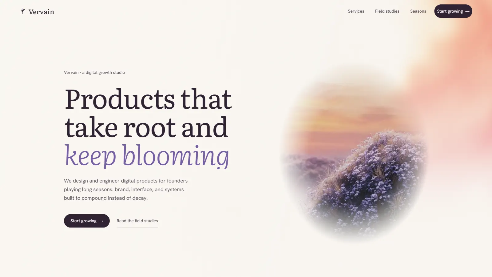
Homepage of the Vervain website designed and developed by Aspire Kinetic Network.
Project background.
Most studio websites promise speed: ship fast, launch loud, move on. Vervain was conceived as the deliberate opposite, a portfolio showcase for a studio whose entire pitch is patience. It answers a real market gap: founders in fintech, healthcare, and retail who need digital products that compound in value instead of decaying after launch.
The concept explores how a single extended metaphor can organise an entire website. Strategy is soil, design is cultivation, engineering is structure, and post-launch care is the growing season. Services, case studies, and process are all renamed and reframed through this botanical lens, Brand Roots, Field Studies, Seasons, so the positioning is felt in the navigation itself, not just stated in the copy.
The intended audience, founders playing long seasons, is sceptical of agency bravado. Vervain counters with calm: a warm cream canvas, literary serif typography, meadow photography, and the quiet confidence of a studio that says "Most studios ship and leave. We stay for the seasons that follow."
Project Classification
Vervain was created by Aspire Kinetic Network as a portfolio showcase project to demonstrate brand narrative, editorial design, user experience, and modern web development capabilities within the digital product and growth services sector.
Industry
Digital Product / Growth Studio
Built By
Aspire Kinetic Network
Status
Live
Business Goals
- ·Attract founders seeking long-term product partners
- ·Differentiate through calm confidence, not agency noise
- ·Communicate retained, ongoing engagement models
- ·Position post-launch care as the core value proposition
Conversion Strategy
Trust-first conversion, the botanical narrative and field studies establish credibility and patience before the single "Start growing" CTA asks for commitment.
Design direction.
The design direction for Vervain was guided by a single premise: growth is quiet. Where most digital studios compete on volume, Vervain competes on stillness, a site that feels like a field journal rather than a pitch deck, designed to attract clients who value durability over spectacle.
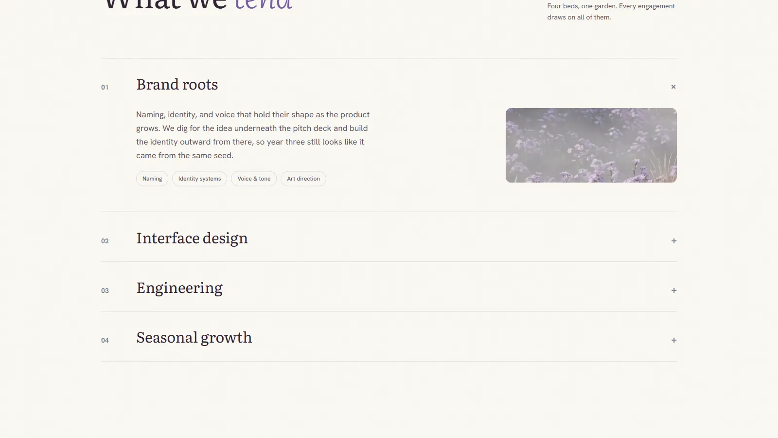
The metaphor dictates the structure. Every section maps to a stage of cultivation: roots (brand), cultivation (interface design), structure (engineering), and seasons (ongoing growth). Case studies become field studies; the process page becomes a calendar of seasons. This consistency turns a marketing device into an information architecture.
Typography leads with a high-contrast editorial serif, its italics reserved for moments of warmth, "keep blooming", while a neutral sans handles interface details. The pairing echoes literary publishing rather than tech branding, signalling patience and craft.
The palette is warm and organic: cream (#F5EFE4 family) as the canvas, deep plum ink for text, and a soft violet drawn from the vervain flower itself as the accent. Meadow photography appears inside organic vignettes, blurred-edge ovals rather than hard rectangles, so imagery feels pressed into the page like botanical specimens.
Motion follows the same temperament. Reveals are slow and soft, parallax is gentle, and nothing snaps or flashes. The interaction design rewards unhurried reading, a deliberate mirror of the studio's promise to stay for the seasons that follow launch.
Key features.
Growth-Rooted Brand Metaphor
A single botanical metaphor, strategy is soil, design is cultivation, runs through every section, turning an abstract service offering into an intuitive, memorable narrative.
Botanical Visual Language
Soft meadow photography, organic vignettes, and pressed-flower motifs give the site a calm, tactile warmth that stands apart from typical studio portfolios.
Editorial Serif Typography
A high-contrast serif with elegant italics leads the voice, literary rather than corporate, paired with a clean sans for supporting copy and interface details.
Light, Airy Composition
A warm cream canvas with generous whitespace creates a reading experience closer to a field journal than a sales page, slowing visitors down and building trust.
Field Studies Showcase
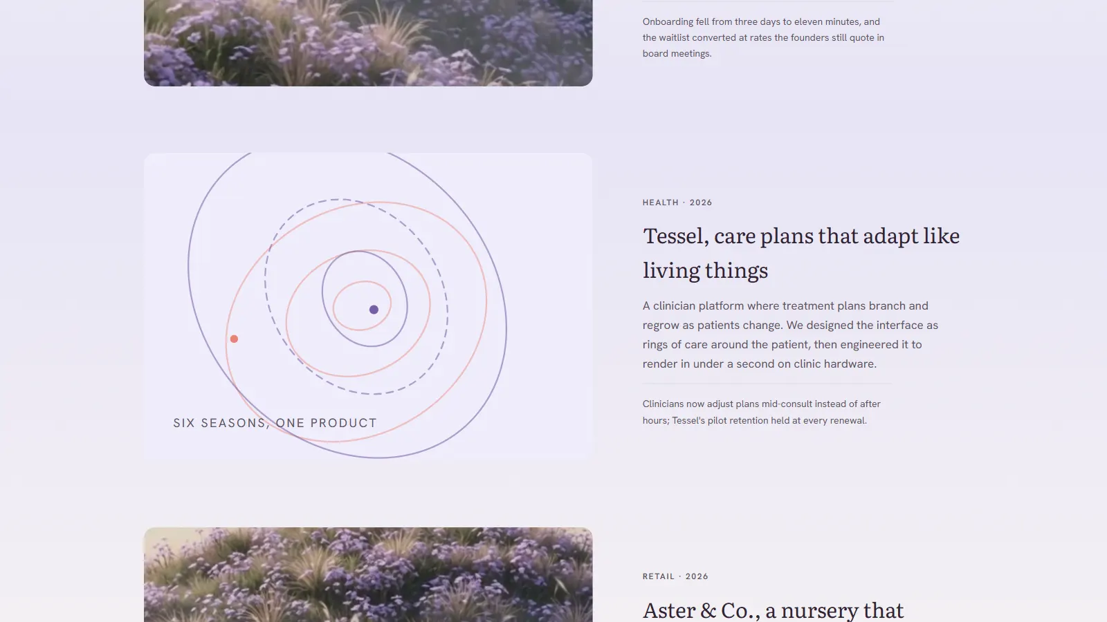
Case studies are framed as "field studies", three project narratives with outcomes and process notes, reinforcing the studio's evidence-over-adjectives positioning.
Seasons Process Framework
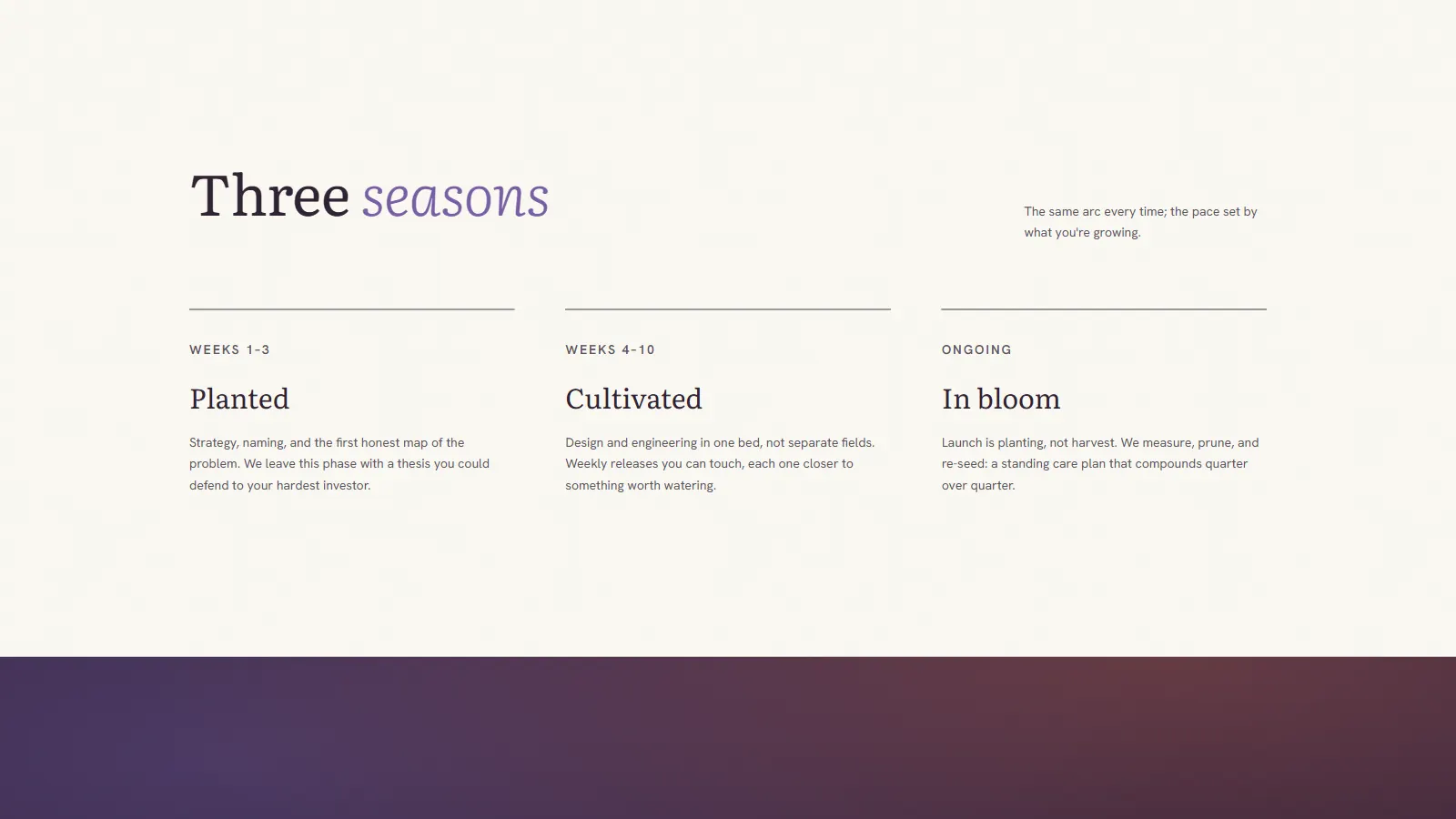
A three-phase process framework emphasises the post-launch season most studios skip: experimentation, SEO, analytics, and ongoing care after shipping.
Narrative Service Architecture
Four service lines, Brand Roots, Interface Design, Engineering, Seasonal Growth, are named and ordered to mirror how a product actually grows from identity to iteration.
Contemplative Pacing
Slow reveals, soft transitions, and unhurried scroll rhythm match the brand promise of long-term partnership over transactional sprints.
Minimal Navigation
A three-item nav, Services, Field Studies, Seasons, plus a single "Start growing" CTA keeps the journey simple and the pitch focused.
Performance & SEO
Built on Next.js with static generation, optimised imagery, semantic markup, and edge deployment. Gentle aesthetics, rigorous engineering underneath.
Tech stack.
Next.js
React framework with App Router and static generation
TypeScript
Type-safe development with full IDE support
Tailwind CSS v4
Utility-first responsive styling system
Framer Motion
Scroll-driven animations and soft transitions
Vercel
Edge-deployed for global fast loads and reliability
Lucide Icons
Lightweight, consistent icon system
Project outcome.
Portfolio Value
Demonstrates AKN's range beyond bold, dark aesthetics, proving the studio can execute warm, editorial, light-mode brand experiences for product companies, wellness brands, and long-horizon founders.
Design Execution
The project shows that a marketing metaphor can become a complete design system, naming, navigation, imagery, and motion all derive from one botanical idea without ever feeling forced.
Sector Positioning
By speaking directly to fintech, healthcare, and retail founders who need durable products, the project opens a pathway into retained, long-term engagement work rather than one-off builds.
Scalability
The field-studies system and seasonal process framework are designed to grow. New case studies and service seasons slot into the existing structure without layout changes.
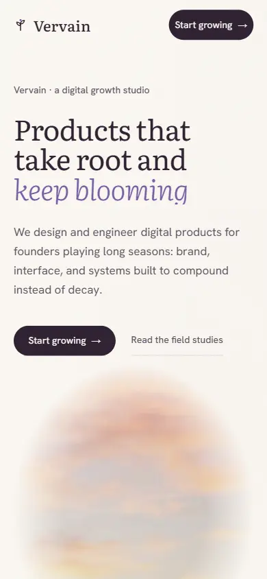
The phone layout keeps the cream canvas and the serif at display size rather than shrinking everything uniformly. The organic vignettes scale with the column, so the imagery still reads as pressed into the page rather than cropped into a thumbnail.
Live Website
See it live.
Visit the live Vervain website to experience the full botanical narrative, editorial design, and field studies in action.
Visit Live WebsiteBuilt by Aspire Kinetic Network
We are a web design and SEO studio in Warangal, Telangana. This was a concept build; the same stack and the same standards go into client work. Founding Partner Programme: five slots, first clients, design and build free on a monthly maintenance plan, while we document the results.