Portfolio Showcase Project
Pharos Division
Aids to Navigation
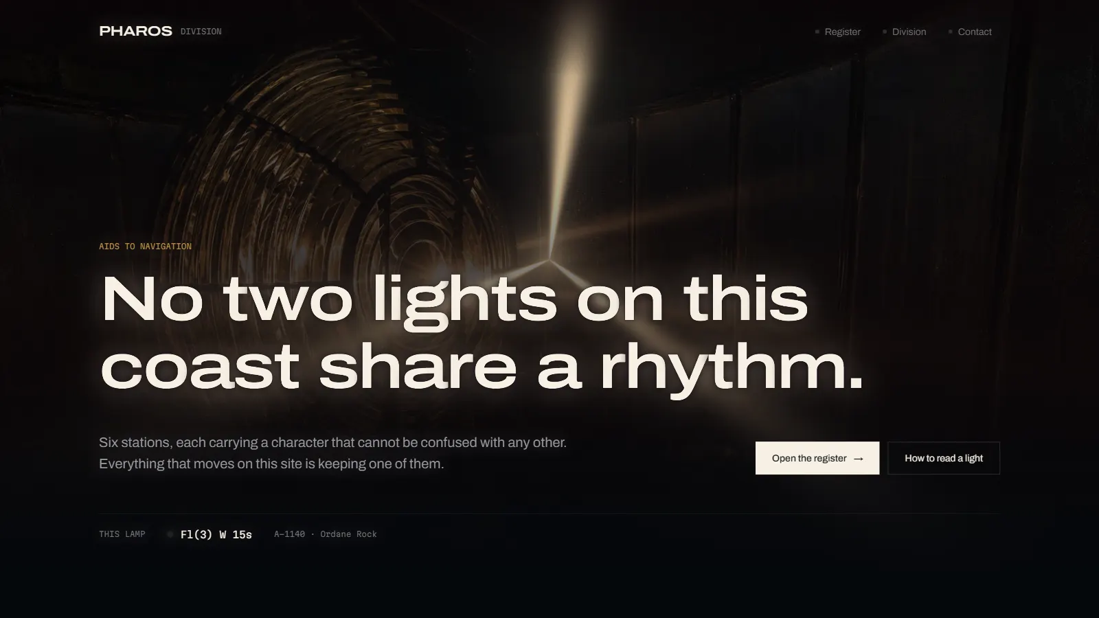
A concept website for a lighthouse authority that does not exist, built around one piece of real navigational grammar: every light on a coast flashes to a different rhythm so a ship can tell them apart in the dark.
The site is organised as a register rather than a brochure. Six stations, each with a character, a height, a range and a year, presented the way a mariner would read them.
The brief
A register, not a landing page.
Most institutional websites open by explaining themselves. Pharos opens by teaching you to read something: a light's character, written the way charts write it, so Fl(3) W 15s stops being a code and becomes a sentence: three flashes, white, every fifteen seconds.
That decision sets everything downstream. The navigation is a register. The sections are numbered entries. Type is set in a single condensed display face against a mono used only for measurements, which is exactly how a nautical publication separates prose from data.
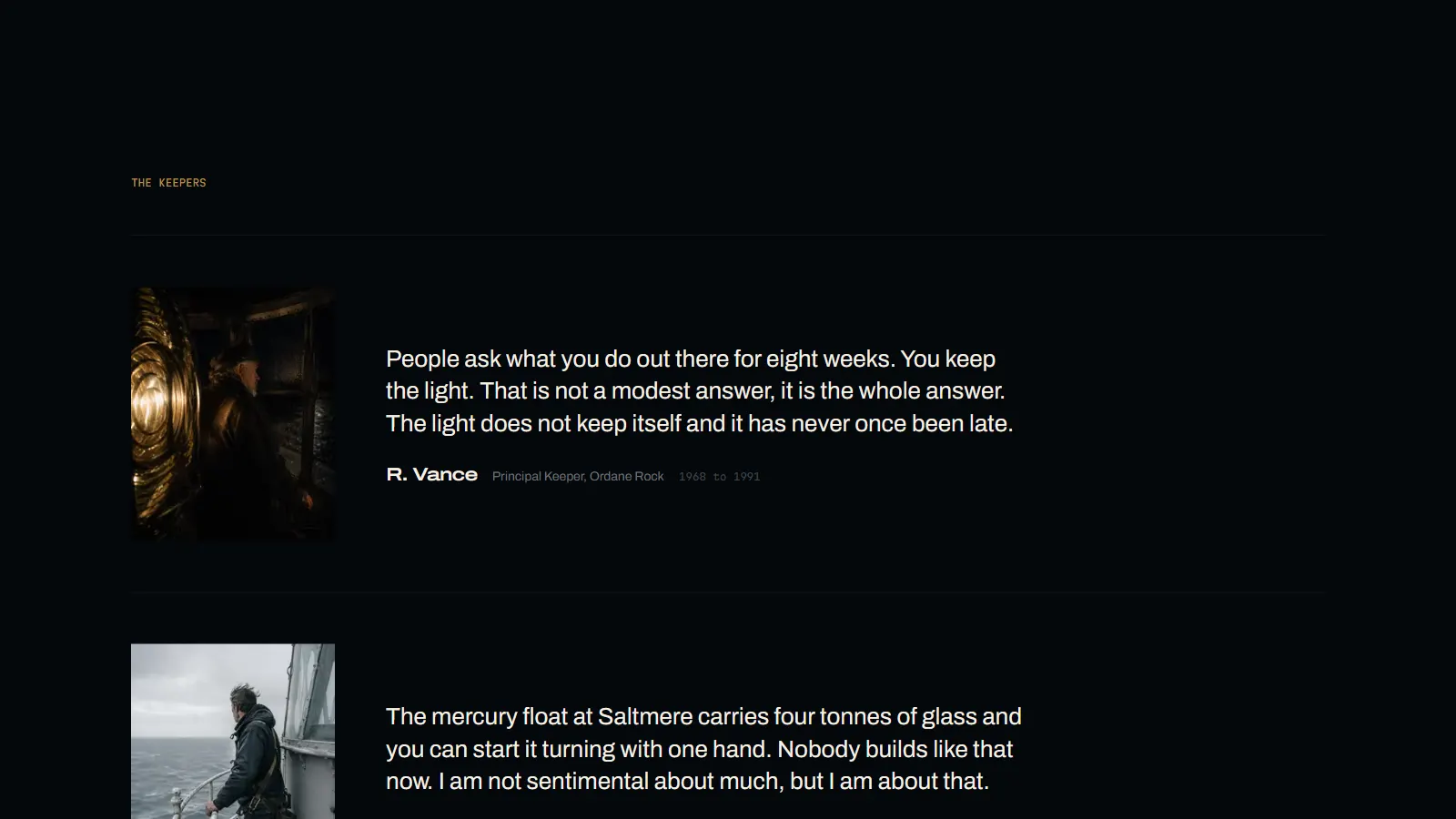
Nothing on the page is decorative colour. Brass is the lamp, red and green are sector lights, and a red sector means there is something under the water in that direction. It never means “important”.
The register · six entries
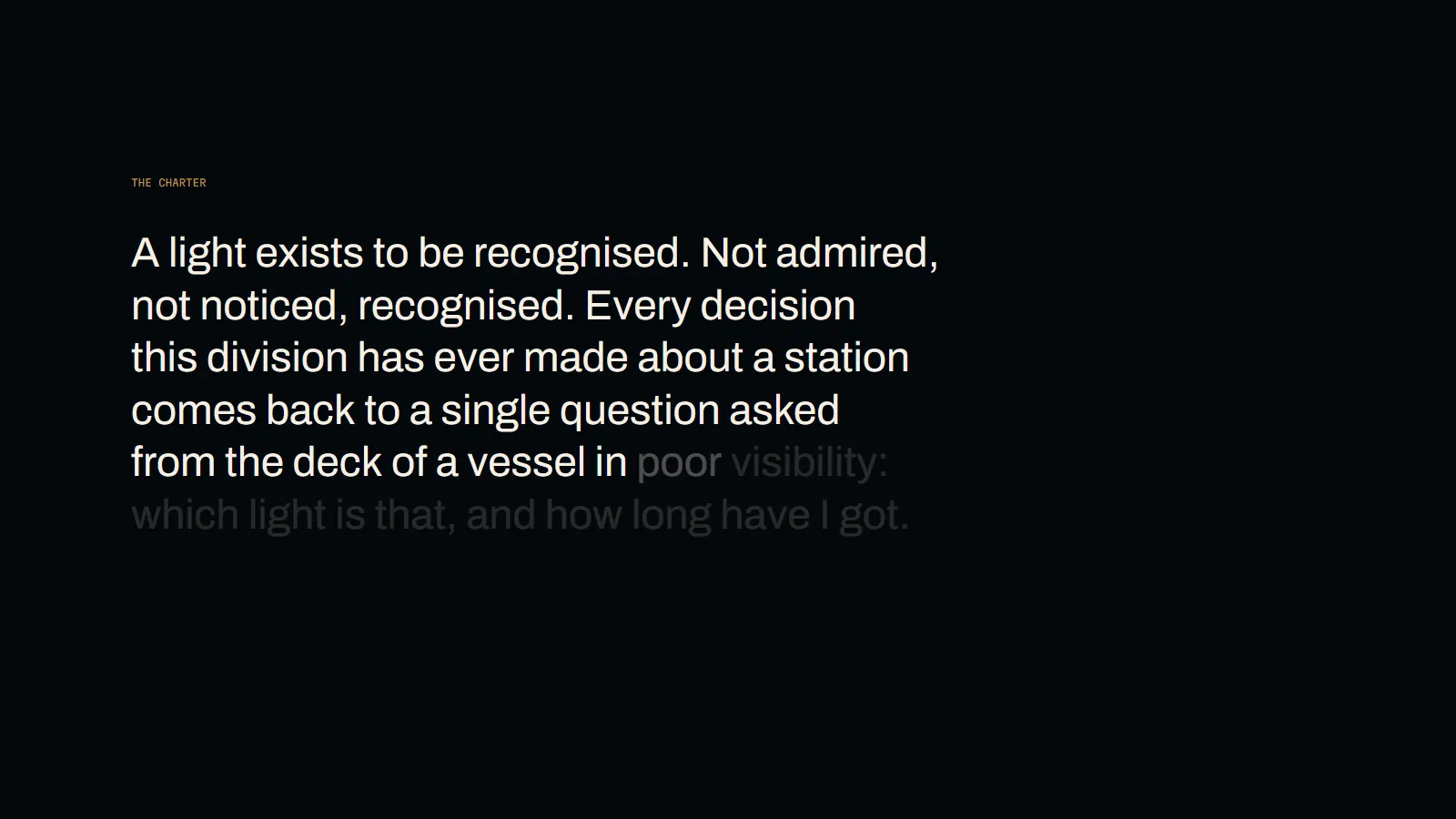
Six stations, six rhythms.
The register is the centre of the site and the reason it holds attention: six stations, each with a photograph, a catalogue number, a character, a focal height and a range. Ordane Rock is a granite tower on a sea-washed stack; Corvenn Reef is a galvanised lattice tower on a tidal reef; Saltmere Head is a rendered masonry tower with a keepers' dwelling.
The entries are pinned while you scroll, so the rhythm strip beside them changes from one station to the next rather than the page cutting between two static blocks. It is one scroll interaction, used once, on the only content that benefits from it.
The keepers · testimony
The people, quoted plainly.
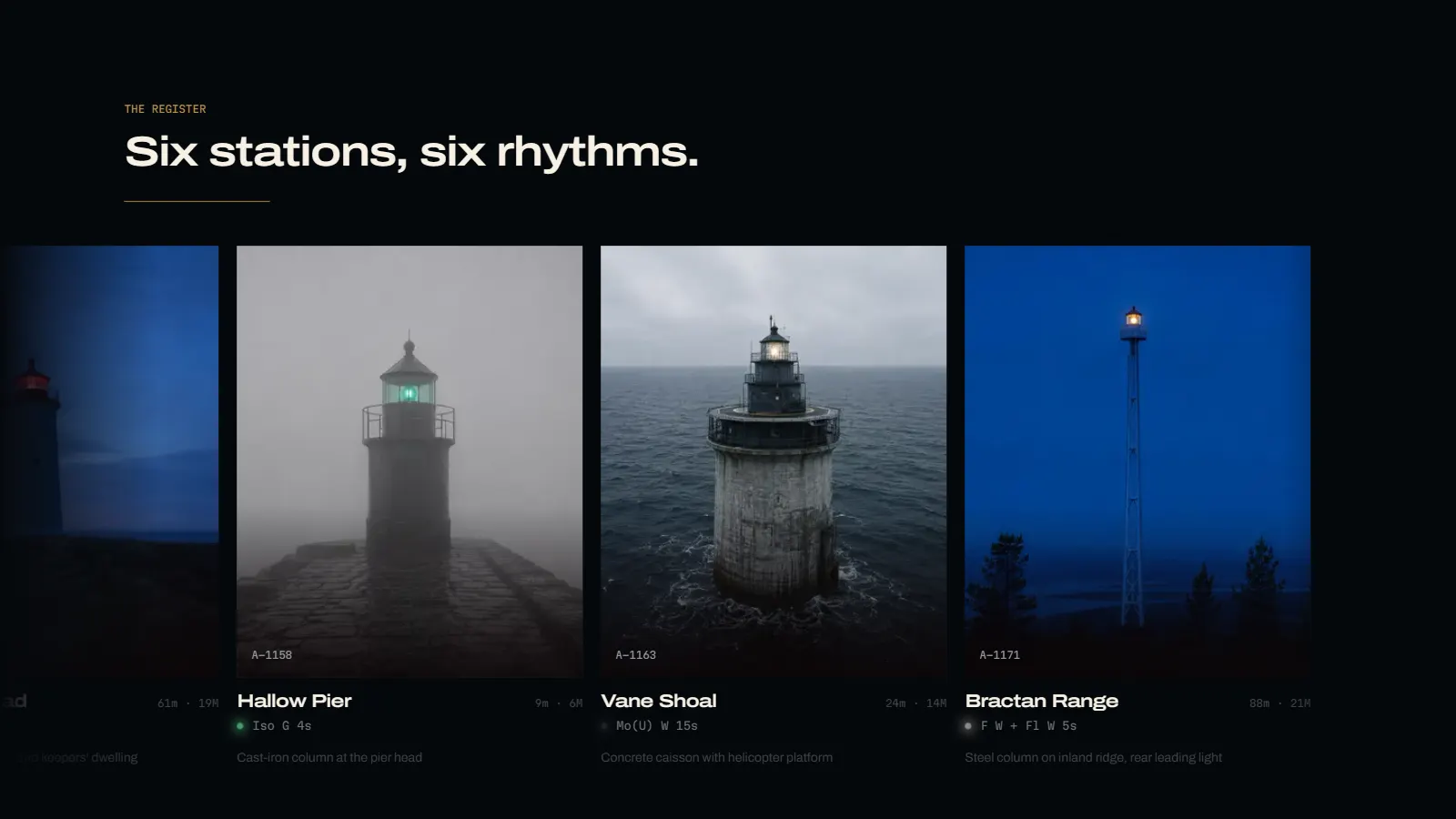
Where a normal site would put testimonials, Pharos puts keepers. Each one is a portrait, a name, a post and a date range, and a few sentences that sound like someone who has done the job: “People ask what you do out there for eight weeks. You keep the light. That is not a modest answer, it is the whole answer.”
No star ratings, no company logos, no claimed percentages. The credibility comes from specificity: four tonnes of glass on a mercury float that one hand can start turning.
The build
What it is made of.
Detected on the live site, not claimed from a template: the pin sequence is GSAP ScrollTrigger, the type is a condensed grotesque against a mono, and the whole thing is a statically generated Next.js build on Vercel.
- Framework
- Next.js App Router, static generation
- Scroll
- GSAP ScrollTrigger, one pinned register and nothing else pinned
- Type
- Condensed display grotesque + monospace for measurements only
- Geometry
- Zero corner radius throughout: chart plates, not cards
- Hosting
- Vercel edge deployment
Small screens
The register still reads at 390px.
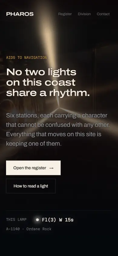
The mobile layout drops the two-column split and keeps the order of information the same: character first, then the tower, then the numbers. Nothing is hidden behind a disclosure, because a register you have to expand is not a register.
The rhythm strips scale with the viewport rather than wrapping, so the one ornament on the page survives the smallest screen it is likely to meet.
“Pharos Division does not exist. The craft that built it does.”
The site's own closing line
Built by Aspire Kinetic Network as a portfolio showcase project: a demonstration of research-led concept work, editorial information design, and scroll choreography used once rather than everywhere.
Visit Live WebsiteBuilt by Aspire Kinetic Network
We are a web design and SEO studio in Warangal, Telangana. This was a concept build; the same stack and the same standards go into client work. Founding Partner Programme: five slots, first clients, design and build free on a monthly maintenance plan, while we document the results.