Meduza
Creative studio & branding
Portfolio showcase project · 2026
A bold concept website built to show how a modern creative studio could present its work, services and attitude through a loud, high-contrast digital experience.
The argument
Creative studios sell confidence. A studio website that looks like everyone else’s undermines the very thing it is trying to prove.
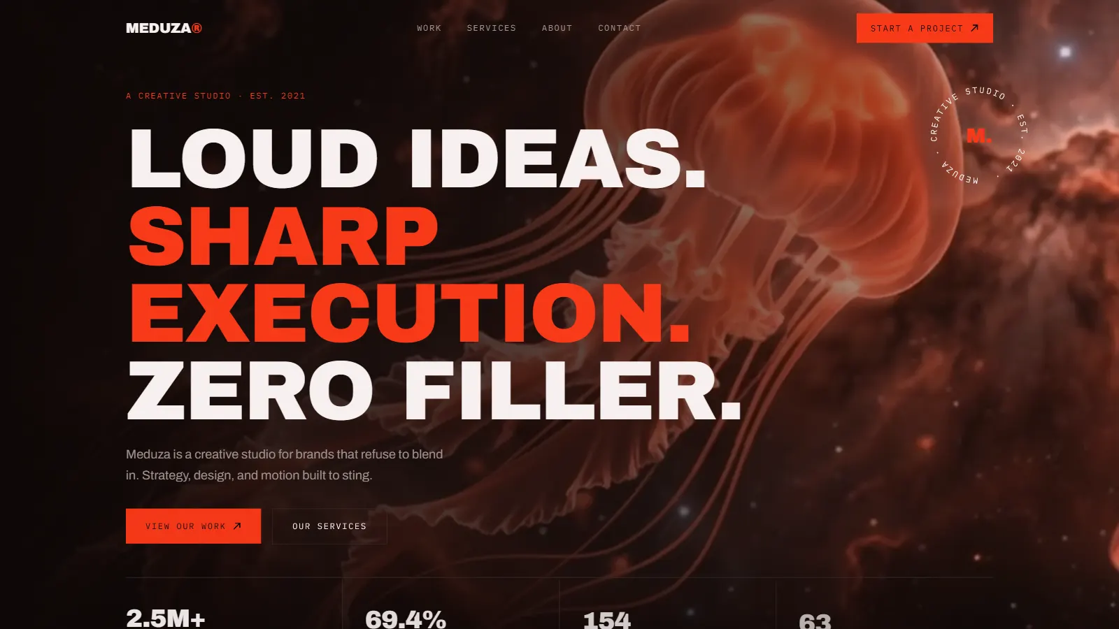
So the site opens with a manifesto (loud ideas, sharp execution, zero filler) and immediately backs it up with featured work, hard numbers and a client roster before a single paragraph of self-description appears.
Founders and marketing leads shopping for a studio that will make them impossible to ignore decide in seconds. MEDUZA is built for that window.
Record
- Industry
- Creative studio / branding
- Built by
- Aspire Kinetic Network
- Status
- Live
- Classification
- Portfolio showcase project: branding, art direction, motion design, web development
What it had to do
- Win clients who want to stand out, not fit in
- Prove creative capability through the site itself
- Convert attention into project inquiries fast
- Position the studio as bold, senior and decisive
How it converts
Attitude-first. The manifesto and the featured work do the persuading, while a persistent "Start a Project" CTA keeps the next step permanently within reach.
Direction
The website is the pitch.
Every visual decision exists to prove the studio’s promise before the visitor reads a word of it. Nothing on the page is neutral.
Typography carries the attitude.
Massive uppercase grotesque headlines dominate the viewport, stacked in alternating white and red-orange to create rhythm and emphasis. Supporting details borrow the precision of technical documentation to balance the bravado of the display type.
The palette is deliberately aggressive.
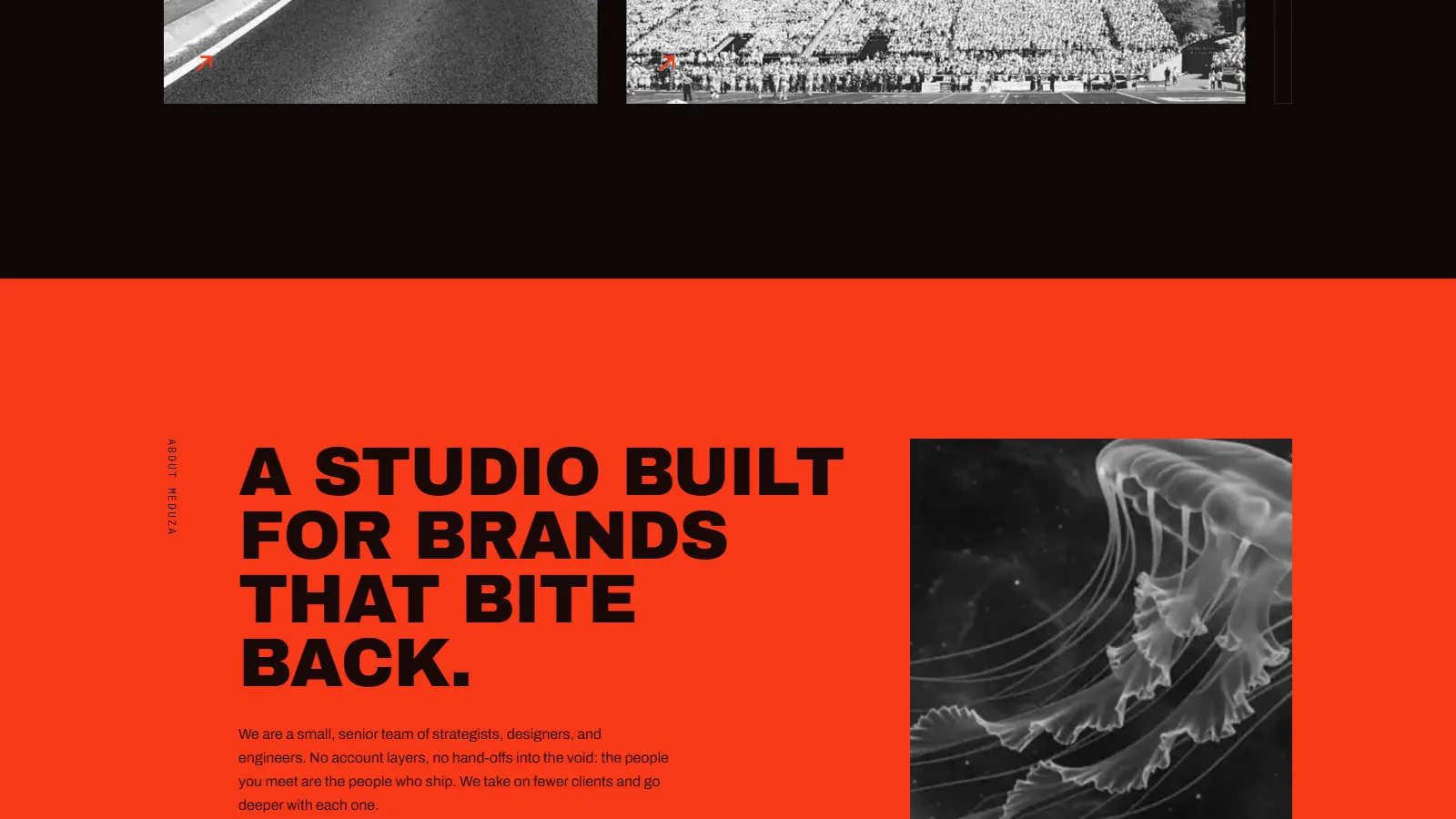
Near-black canvas, incandescent red-orange, stark white. The jellyfish, the studio’s namesake and mascot, appears as ember-toned full-bleed imagery behind the hero, giving the darkness depth and the accent something to burn against.
Layout follows a proof-first sequence.
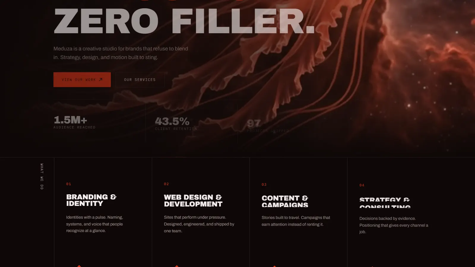
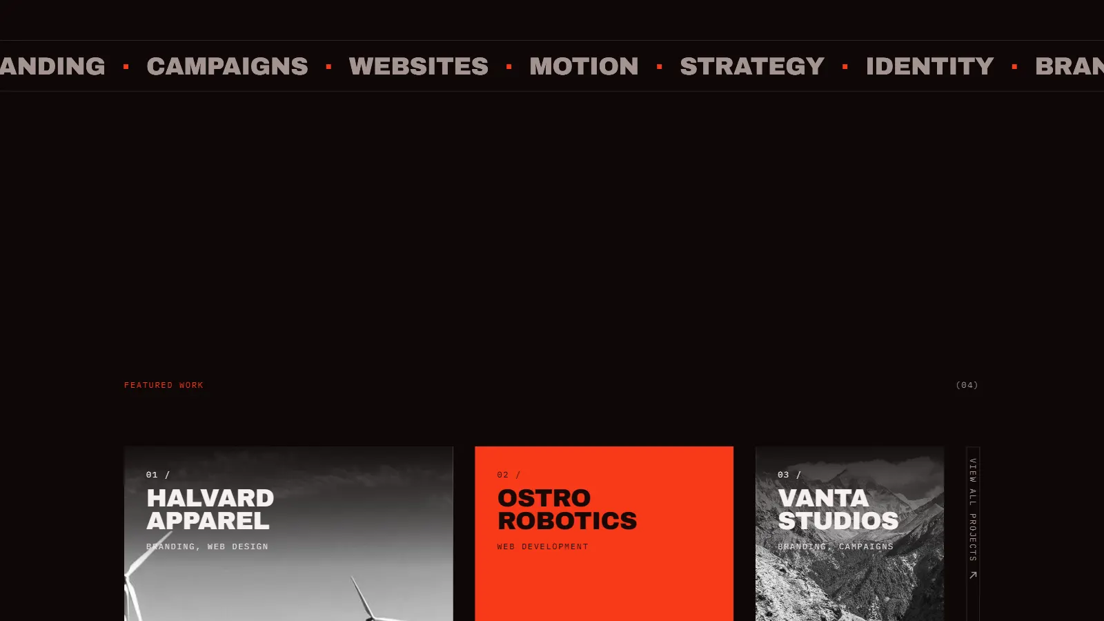
Manifesto, featured work, hard numbers, services, client roster, contact. Self-description is pushed to the bottom of the hierarchy because the target client does not buy adjectives, they buy evidence.
Motion is brand voice, not polish.
Scroll reveals are fast and decisive, hover states snap rather than ease, and the circular stamp mark rotates continuously, small kinetic details that keep the page feeling alive and slightly dangerous, exactly as the brand intends.
What it does
- 01
Loud brand voice
Every headline is written to be shouted, not whispered. Oversized display typography and blunt, confident copy give the studio an unmistakable voice that refuses to blend in.
- 02
High-impact hero
A full-bleed jellyfish visual paired with the "Loud ideas. Sharp execution. Zero filler." manifesto establishes the brand attitude within the first second of the visit.
- 03
Distinct visual identity
A signature red-orange accent, rotating circular stamp mark, and monospaced detail type create a recognisable identity system that carries across every section.
- 04
Portfolio-first architecture
Featured work sits directly below the hero, four flagship projects presented with large imagery and minimal chrome, so the output speaks before the sales pitch.
- 05
Brutalist typography
Massive uppercase headlines set in a heavy grotesque drive the visual rhythm. Text is treated as the primary graphic element rather than a supporting layer.
- 06
Motion built to sting
Scroll-triggered reveals, hover distortions, and kinetic type keep the page alive without slowing it down: motion as attitude, not decoration.
- 07
Proof-driven stats
Audience reach, retention, projects shipped, and brands transformed are surfaced as bold numeric counters, evidence backing up the confident tone.
- 08
Dark cinematic mood
A near-black canvas with ember-toned imagery gives the site a cinematic depth that makes the red-orange accent and white type burn brighter.
- 09
Frictionless navigation
A four-item nav (Work, Services, About, Contact) plus a persistent "Start a Project" CTA keeps the path to conversion one click away from anywhere.
- 10
Performance and SEO
Built on Next.js with static generation, optimised assets, semantic markup, and edge deployment. Loud design, lightweight delivery.
Built with
- Next.js
- App Router, static generation
- TypeScript
- Type-safe across the codebase
- Tailwind CSS v4
- Utility-first responsive styling
- Framer Motion
- Scroll-driven kinetic transitions
- Vercel
- Edge-deployed for global fast loads
- Lucide Icons
- Lightweight icon system
Outcome
Portfolio value
Demonstrates AKN’s ability to execute high-attitude brand experiences for creative agencies, studios, and consumer brands, a portfolio piece aimed squarely at clients who want to be impossible to ignore.
Design execution
The project proves that loud design and disciplined engineering coexist. MEDUZA hits hard visually while loading instantly, staying accessible, and holding up on every screen size.
Sector positioning
By targeting the creative services industry with a maximalist visual language, the project opens a pathway into brand-led sectors where distinctiveness is the primary buying criterion.
Scalability
The featured-work system and service architecture are designed to scale. New projects slot into the existing structure without layout changes as the studio grows.
Small screens
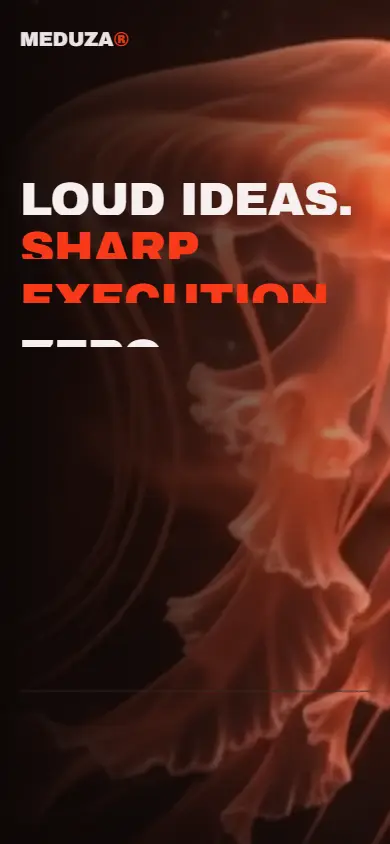
Live website
See it livemeduza-chi.vercel.appBuilt by Aspire Kinetic Network
We are a web design and SEO studio in Warangal, Telangana. This was a concept build; the same stack and the same standards go into client work. Founding Partner Programme: five slots, first clients, design and build free on a monthly maintenance plan, while we document the results.