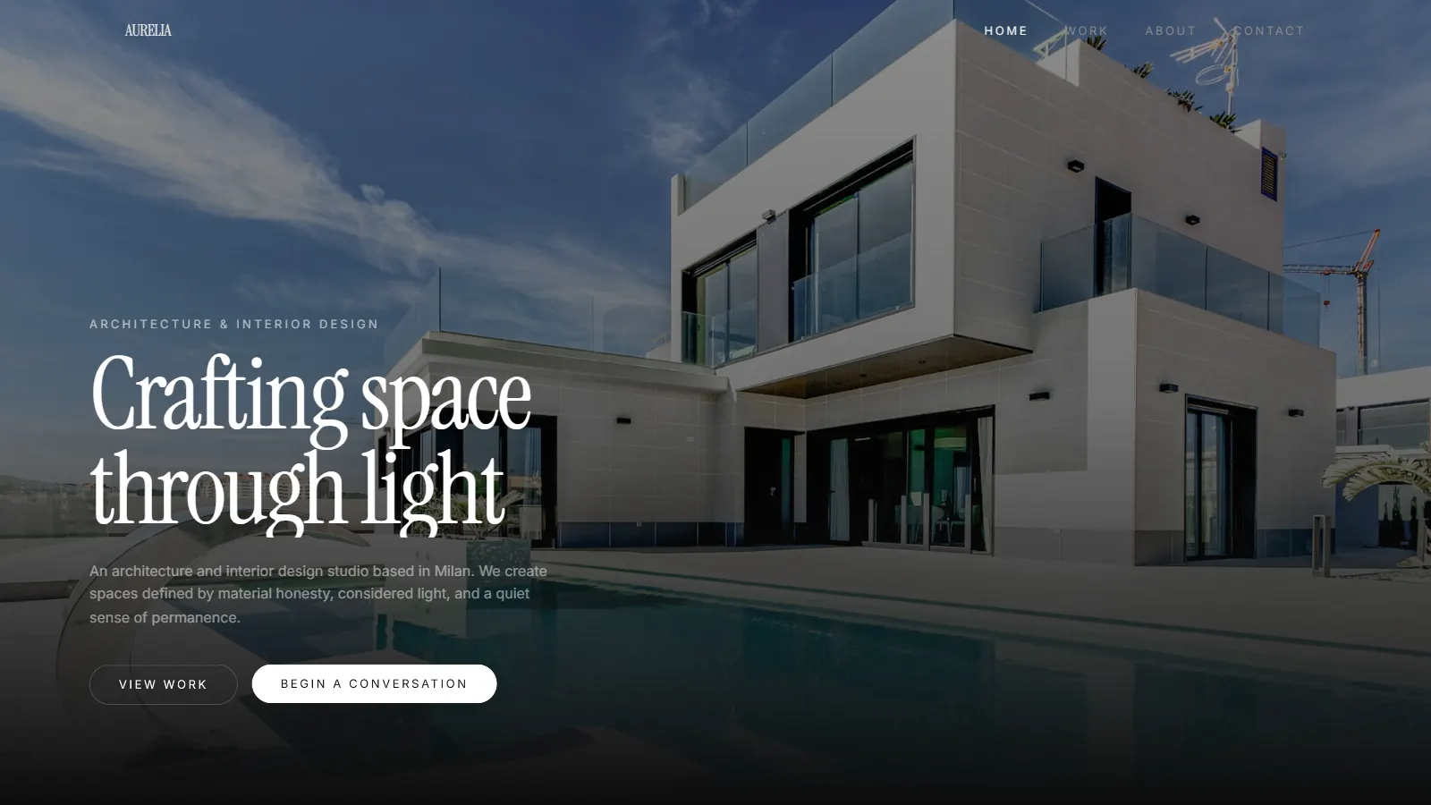
Portfolio showcase project · 2026
AURELIA Atelier
Architecture & interior design
A premium concept website showing how a modern architecture practice could present its philosophy, projects and process through an experience built on imagery, typography and narrative pacing rather than on features and grids.
The brief
Architecture firms rarely need websites that merely list services. They need digital spaces that evoke the same sense of materiality, light and atmosphere their physical work embodies.
AURELIA Atelier was conceived as a response to that: a portfolio showcase that approaches digital presentation with the same rigour a design studio brings to a building. Rather than organising work inside conventional grid templates, the site treats each project as a narrative chapter, giving photography room to breathe and typography space to speak.
The intended audience (high-net-worth homeowners, boutique developers and architecture enthusiasts) expects discretion, precision and a point of view. AURELIA delivers this through restraint: minimal navigation, generous whitespace, a monochromatic palette rooted in deep black and warm white, and typography drawn from the luxury publishing tradition.
The chapters
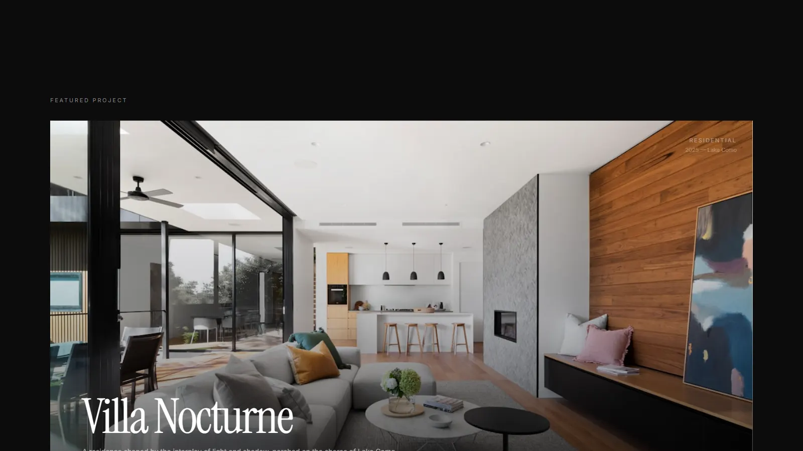
The site is organised as five elemental spreads rather than as pages. Each one is a single idea given a full screen, and the transition between them is the pacing device.
Stone
Material as the first impression: weight, grain and permanence before any headline.
Light
Full-screen photography carrying the atmosphere the copy never has to describe.
Shadow
Negative space used as an active compositional tool rather than leftover margin.
Material
Detail imagery at a scale that reads as texture, not as a thumbnail.
Silence
Deliberate emptiness between sections, pacing the scroll like a gallery walk.
Direction
The design direction was guided by a single premise: architecture is experienced through atmosphere, not information. Translating that into digital meant resisting the temptation to fill the page, and instead allowing emptiness, pace and material texture to carry the narrative.
The layout follows an editorial structure closer to a monograph than a website. Each section is given room to exist on its own terms. Full-screen hero typography introduces the practice, a philosophical statement follows in generous leading, then a sequence of elemental spreads functions as visual chapters. The spacing between sections is as deliberate as the content within them.
Typography is the primary architectural tool. A high-contrast serif display face commands the hero and section headings, evoking the authority of luxury publishing. Body copy is set with generous measure and leading, creating a reading rhythm that slows the visitor down, a deliberate counterpoint to the rapid scanning most websites encourage.
The palette is restrained: deep black, warm white, and subtle stone and charcoal tones. This monochromatic foundation keeps photography the dominant visual force. Colour, when it appears, comes from the built environment captured in the imagery, not from the interface.
Interaction philosophy centres on patience. Scroll-driven transitions are slow. Hover states are subtle. Navigation is a four-item bar that never competes with the content. The experience is designed to feel less like browsing and more like walking through a gallery.
What it does
Luxury visual storytelling
Full-bleed editorial imagery drives the narrative, with large-format photography serving as the primary communication layer. Every image is treated as a spatial experience, not a decorative element.
Scroll-driven narrative
The page unfolds like a printed editorial. Cinematic pacing guides the visitor through philosophy, process and featured work with deliberate rhythm and breathing room between sections.
Responsive portfolio architecture
The layout adapts fluidly from mobile to ultra-wide displays while preserving typographic hierarchy, image scale and the editorial reading rhythm across every breakpoint.
Dynamic project showcase
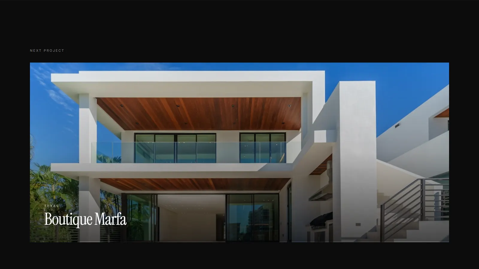
A scalable project grid supports individual case studies with dedicated routes, large-format hero imagery and structured content, designed to grow as the portfolio expands.
Material-focused design
The visual system is organised around elemental themes, mirroring how architecture itself is experienced through atmosphere rather than navigation.
Editorial typography
High-contrast serif display faces command attention at scale, supported by refined body text with generous leading. The typographic voice is quiet, confident and unmistakably premium.
Content architecture
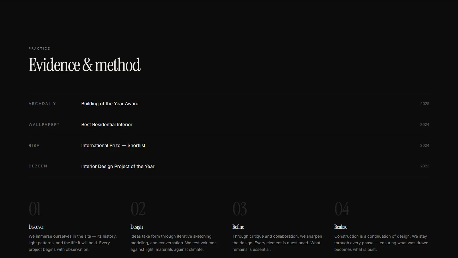
Five sections, in order: philosophy, awards, process, portfolio, practice. What the studio makes, then how the work is made, then why it is made that way.
Museum-gallery presentation
Whitespace is used as an active compositional tool. Large visual breaks, sparse layouts and full-screen transitions evoke the experience of moving through a gallery.
Minimal navigation
A four-item top navigation removes friction entirely. The interface steps aside so the work and the philosophy remain the focus.
Performance and SEO
Built on Next.js with static generation, optimised asset loading, semantic markup and edge deployment. The structural groundwork a practice would need to be found and read quickly. Concept build: nothing here has been measured in the field.
Outcome
Portfolio value
Demonstrates AKN’s ability to execute premium brand experiences for architecture, interior design and luxury real estate, a portfolio piece that speaks directly to high-end creative clients.
Design execution
Editorial rigour and technical restraint were treated as one problem rather than two. The page is held to a performance budget and still reads as considered as a printed monograph.
Sector positioning
By pitching the visual language at architecture and interior design specifically, the project opens a pathway into luxury creative sectors where narrative quality matters as much as execution.
Scalability
The content architecture and project showcase system are designed to scale. New projects slot into the existing structure without layout changes, making it suitable for growing practices.
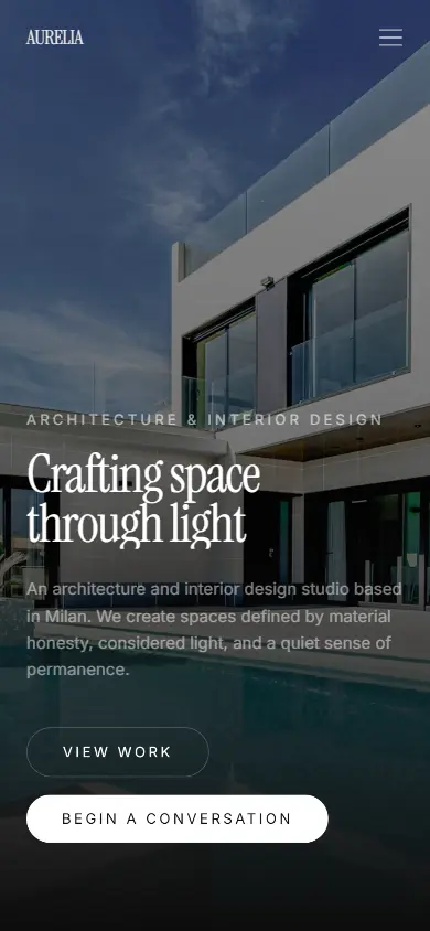
On a phone
Colophon
- Industry
- Architecture and interior design
- Built by
- Aspire Kinetic Network
- Status
- Live
- Stack
- Next.js · TypeScript · Tailwind CSS v4 · Framer Motion · Vercel
- Brief
- Generate qualified inquiries from high-net-worth clients; establish portfolio credibility for luxury design services; communicate design philosophy through narrative rather than description; position the studio within the premium architecture market.
- Conversion
- Narrative-first. Immersive imagery and editorial content build trust and desire before the visitor ever reaches a contact form.
- Classification
- Portfolio showcase project: branding, user experience, visual storytelling and web development.
Built by Aspire Kinetic Network
We are a web design and SEO studio in Warangal, Telangana. This was a concept build; the same stack and the same standards go into client work. Founding Partner Programme: five slots, first clients, design and build free on a monthly maintenance plan, while we document the results.